Overview
Project Brief
In a bid to redefine its online footprint, the Harvard Graduate School of Education (HGSE) embarked on a groundbreaking journey to launch a new and upgraded website. This initiative aimed not only to captivate the general public but also to engage the discerning eye of web development experts. Core features included a design facelift with a focus on consolidating patterns, adherence to best coding practices, migration to Drupal 10, and the integration of Salesforce to unveil the dynamic Course Explorer.

New Homepage.
Aesthetics and User Experience
Redefining Patterns
The website's design revamp wasn't merely about a fresh coat of paint; it was a thoughtful consolidation of patterns from the old site. The result: an aesthetically pleasing and harmonious interface that seamlessly blends the familiarity of the past with a modern touch.
Best Practices and Accessibility
Beyond visual appeal, the project placed a premium on adhering to the highest coding standards and accessibility norms. The website now stands as a beacon of inclusive design, ensuring that every visitor, regardless of ability, has a seamless and enriching experience.

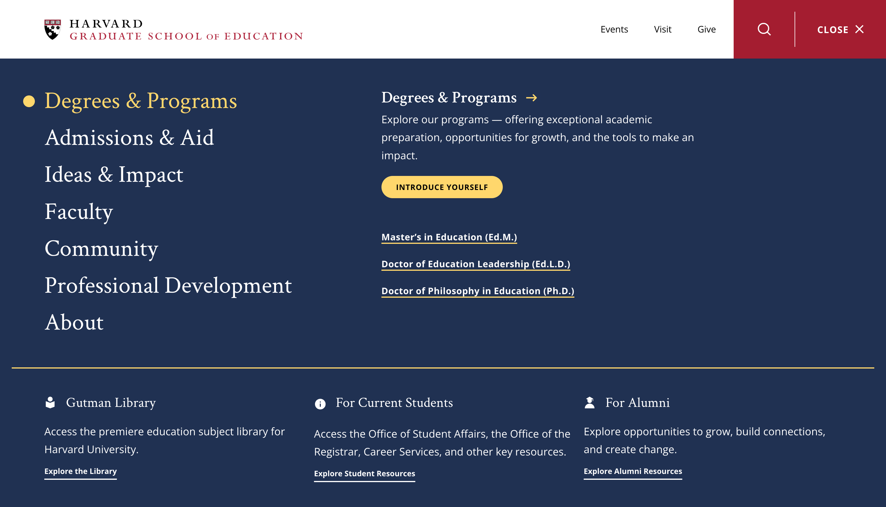
Megamenu design.
Technical Migration and Integration
Drupal 10 Upgrade
Migrating from Drupal 7 to Drupal 10 marked a technological leap for HGSE. This upgrade not only future-proofed the site but also set the stage for continuous innovation, reinforcing HGSE's commitment to staying at the forefront of web development.
Salesforce Integration: Empowering Exploration
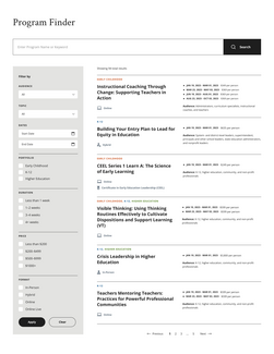
The integration of Salesforce brought forth the Program Finder, a feature designed to enhance find-ability and user engagement. Prospective students, researchers, and the curious public now navigate an intuitive platform, seamlessly discovering the diverse courses offered by HGSE.
Future Directions
Ongoing Innovation
The website's launch isn't a conclusion but a commencement. HGSE envisions continuous innovation, exploring emerging technologies, interactive features, and further integrations.


